
Thomas Cook (India) Limited – India’s leading omnichannel travel services company has unveiled their new logo inspired by the changing environment, renewed energy and excitement that define the company in this new era of travel.
While the pandemic has had a severe impact on the travel sector, Thomas Cook India has displayed exceptional agility and innovation in the revival and transformation of its businesses. The down time also enabled the Company to accelerate its Digital First focus and an encouraging outcome is the significant drop of approx. ten years in the average age of its holiday customers. India is the youngest demography in the world with a significant growth in digital economy including acceleration of e-commerce and digital discovery. Thomas Cook India provides a powerful omnichannel network – offering customers the choice and convenience of selecting their preferred mode of communication: via holiday app, virtual holiday store, website, call centre or extensive retail network pan India.
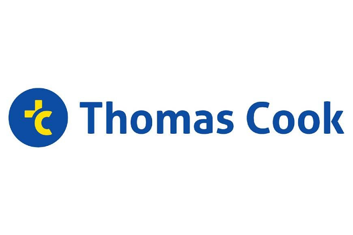
To keep pace with a younger customer and a changing environment, the dynamic new logo delivers a strong/impactful identity that is future proof, and most importantly, a digital-friendly look & feel.
A key driver to this new logo, was the idea to create a more open, friendly and informal (lower case letters Vs capitals) identity. In the new logo, the abbreviation of the brand name, “TC”, is a younger representation of the brand while retaining its reputation of expertise in travel and travel related solutions. The “TC” moniker is placed within ‘the circle of trust’ to showcase brand reliability and it also creates a stronger, more visible and recallable visual digital asset for platforms like websites, social media, app icons etc. The colours of the logo are inspired by the wonderful metaphors for the joy and discovery of travel and the freedom it represents – blue for sky and water and yellow for the sun and energy. The logo emphasizes the Thomas Cook brand name, while adding a visual mnemonic to promote brand recall. Thomas Cook India’s new visual identity represents years of excellence in the travel industry and the drive to create memorable travel experiences.
Abraham Alapatt, President & Group Head – Marketing, Service Quality, Value Added Services & Innovation, Thomas Cook (India) and SOTC Travel said, “The pandemic has changed several norms in the travel industry and to keep pace with the changing environment/expectations of customers, we are refreshing the familiar Thomas Cook logo with a stronger, more impactful, digital-friendly identity. Our dynamic new logo embodies our fluid and dynamic personality as we transform continually in line with the rapidly changing travel services industry & reconfirms our continued commitment to customer delight with unmatched travel experiences.”


